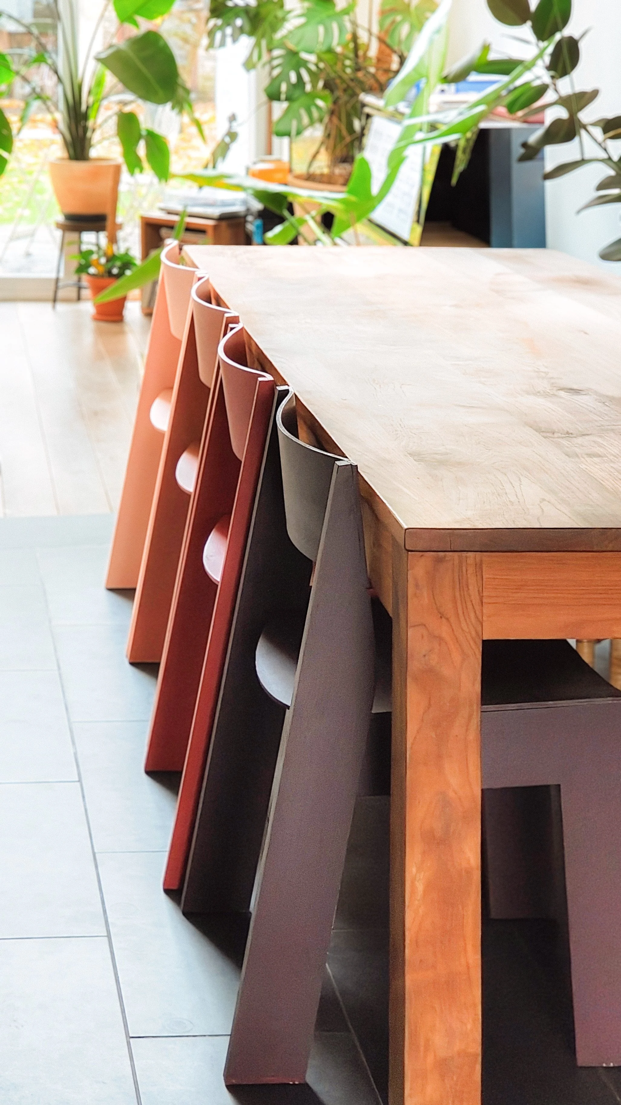

rood
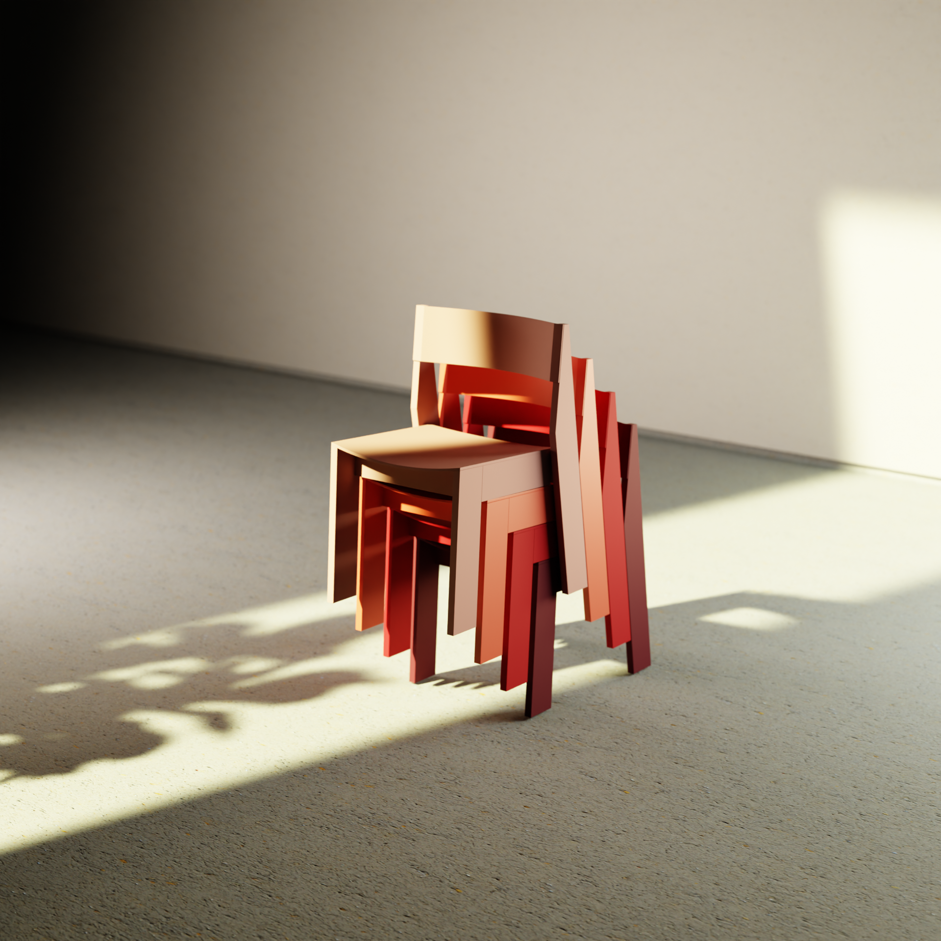
This design began as a colour study, all four hues stem from a single, “universal” red interacting with sunlight. As light touches flat and curved surfaces, new tones appear. One versus four; together, they read as red, yet seen in isolation, their red identity becomes uncertain.
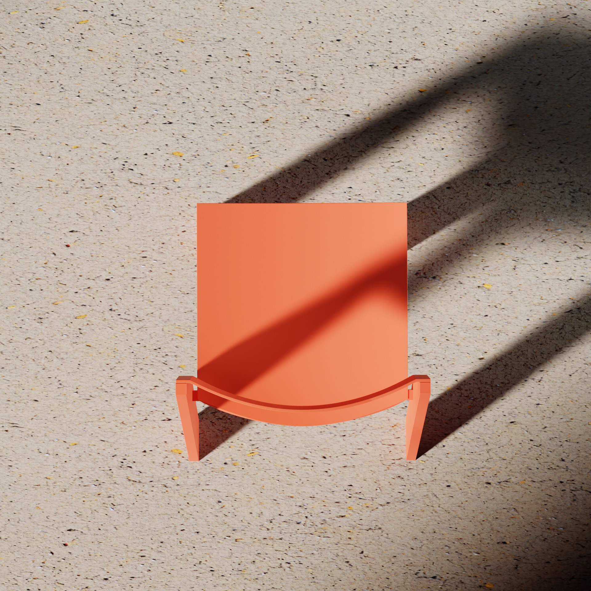
Within the process I did some close research on the colour red. One of the first actively described colours in history where we can see the widest spectrum of colour nuances in. With a subtle reference to the vermillion red of Japanese torii gates, this design not only recalls the specific shade of colour but also the visual reference in the front lines of the design, gently echoing the form of the torii gate.
The process behind the shape comes an exploration of proportion; to play with a balance between solid shapes and visual lightness. To reduce visual weight, the backrest aligns with the height of the tabletop, allowing the chair to becoming one without adding visual clutter.
To bring a sense of optimism and playfulness to this essential form, the proportions evoke a subtle sense of youthful optimism without actively noticing.
As is common in many chair collections, this design also wants to offers the option to upholster the seat and/or backrest. Currently, I am designing a sustainable alternative to traditional foam upholstery, focusing on new materials that are easier to maintain, wash, repair and recycle.